
What is mobile-first design?

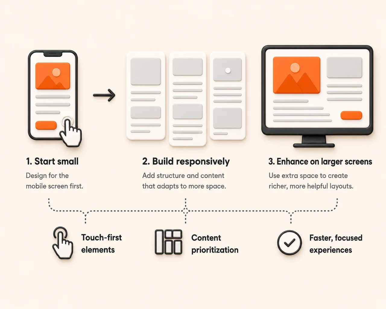
Mobile-first design means the phone version of your site is designed first, and the desktop version grows out of it. It is the opposite of the old habit of building a big desktop page and then squashing it down to fit a phone. It matters because most of your visitors are on a phone, and because Google looks at the mobile version of your site when it decides how to rank you.
In plain English
Think of it like packing a carry-on bag before a big suitcase. If you start with the carry-on, you are forced to decide what actually matters, and everything you add later is a bonus. Start with the big suitcase and you end up cramming, folding and sitting on the lid — which is exactly what a shrunken desktop site feels like in someone's hand.
Three things to know
Google reads the phone version
Google crawls and indexes the mobile version of your pages, so anything hidden or stripped out on mobile is effectively invisible to search.
Thumbs, not cursors
Buttons need to be big enough to tap, text big enough to read without pinching, and phone numbers tappable so someone can call you in one move.
Cut before you shrink
If a section does not earn its place on a small screen, it probably was not doing much on a big screen either — decide what matters first, then let the layout grow.
Worth remembering
According to Statcounter Global Stats, mobile devices accounted for 51.51% of worldwide web traffic in June 2026, compared with 47.12% for desktop and 1.36% for tablets.
More than half the internet is already holding a phone when they find you, and for local searches like "near me" that share is usually higher still. If your site only feels good on a laptop, you are doing your best work for the smaller half of your audience.
What to do about it
I build every site on the phone screen first, then let it open up on bigger ones — so the version most people see is the one that got the most care. If you want to know how yours holds up in a hand, Get a free website audit.
Where this shows up in my work
 Cookies on this site