
What is a CTA?

CTA stands for Call To Action. It is the one button you want every visitor to click: book, buy, call, sign up. "Click here" is the CTA everyone settles for, and it quietly costs them customers.
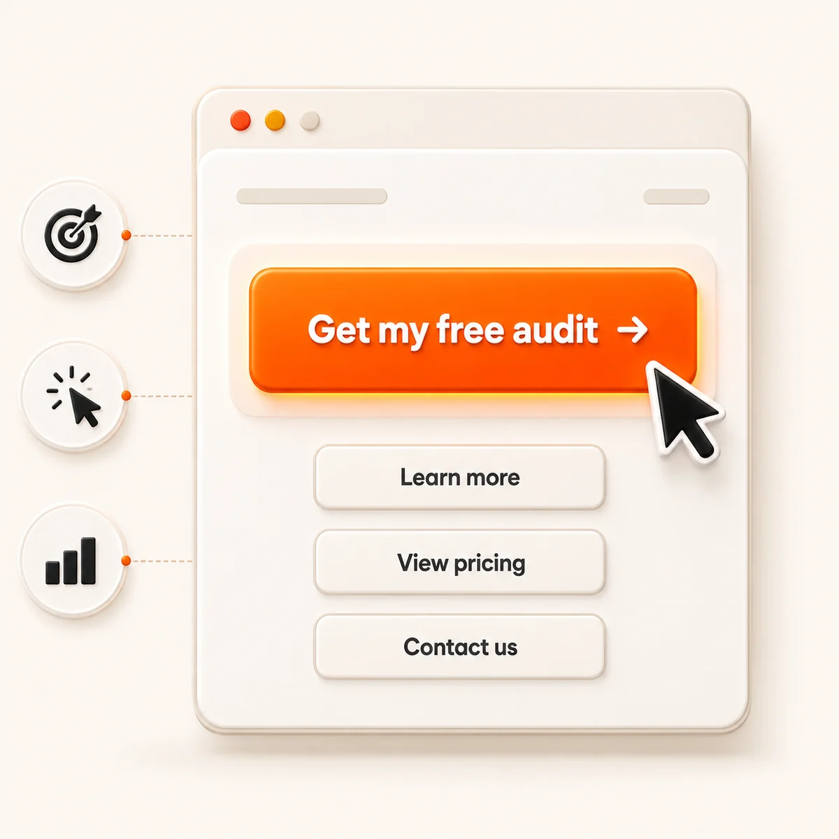
In plain English
A good CTA is a clear door with a sign that tells you exactly where it leads. A weak one is an unmarked door most people walk right past. The words on the button, and how easy it is to spot, do a lot of the selling.
Three things make it work
Be clear
Say exactly what happens next, like "Get my free audit," not a vague "Submit."
Lead with a verb
Start with the action so the button reads as a thing to do, not a thing to think about.
Make it pop
Use color and placement so the button is impossible to miss on the page.
Worth remembering
HubSpot found a personalized CTA converts 202% better than a generic one.
Same traffic, a better button, and more than double the results. The call to action is one of the highest-leverage things on your whole site.
What to do about it
Rewrite your main buttons to name the exact next step, then make them the boldest thing on the page. Want a review of the CTAs across your site? Get a free website audit.
Where this shows up in my work
 Cookies on this site